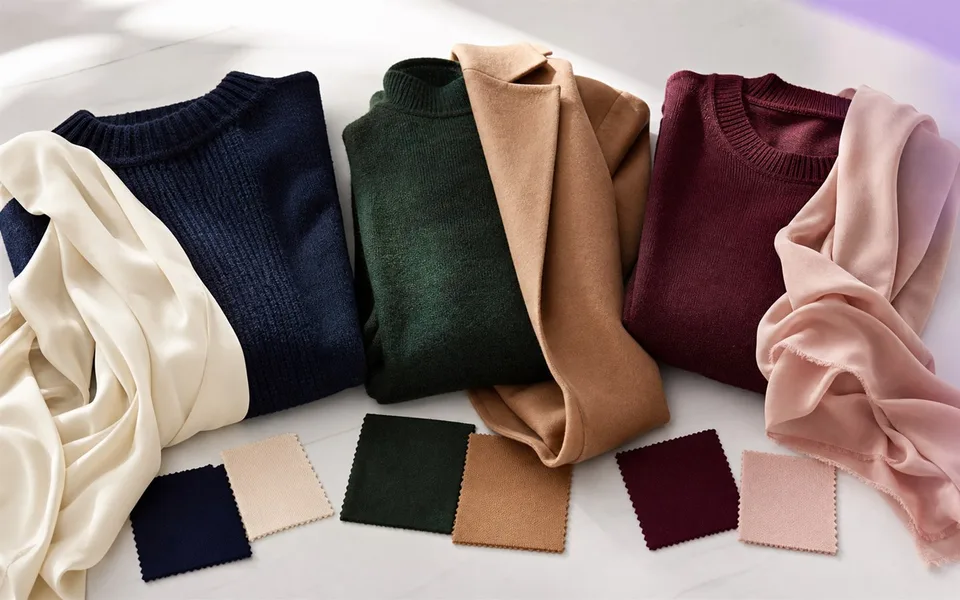
Color is often the first thing people notice about an outfit, but matching colors does not mean making them identical. The easiest outfits usually have a clear hierarchy: one foundation, one supporting color, and—if you want it—one accent.
Build from a neutral foundation
Neutrals give the eye somewhere to rest. Black, white, cream, navy, charcoal, camel, olive, chocolate, and denim can all behave like neutrals depending on the outfit. Choose one or two as the foundation, then add color through a top, layer, shoe, or accessory.
For example, navy trousers and a white shirt can support burgundy shoes, a green knit, or a cobalt bag. The neutral base makes the accent look intentional rather than accidental.
Repeat a color once
Repetition is one of the simplest ways to create cohesion. The repeated color does not need to match exactly. A warm brown belt can support tan shoes. A burgundy print can connect to a darker red bag. A silver watch can echo cool gray hardware.
Use repetition lightly. Two points of connection are usually enough; repeating the same bright color in four places can make the outfit feel overly coordinated.
Three reliable color formulas
1. Monochromatic, with depth
Wear several shades of one color family—such as cream, oatmeal, taupe, and chocolate. Vary texture and lightness so the look has dimension. This formula is calm, polished, and easy to repeat.
2. Neutral base plus one accent
Build the outfit in two neutrals, then add one clear color. Think charcoal and white with cobalt, navy and cream with rust, or black and gray with pink. This is the most beginner-friendly formula.
3. Neighboring colors
Colors that sit close together—blue and green, red and orange, violet and blue—often blend smoothly. Keep one color dominant and the other smaller so the combination has direction.
Use contrast to control attention
High contrast draws attention: black with white, bright red with pale cream, or cobalt with orange. Low contrast feels softer: beige with camel, navy with charcoal, or sage with olive. Choose contrast based on the mood and occasion rather than treating one as better.
If the top half has the strongest contrast, attention moves upward. A bright shoe against dark trousers pulls attention down. This can help you decide where the outfit's focal point should be.
How to match a printed piece
Choose one color already present in the print and repeat it in a solid item. If the print is bold, keep the rest of the outfit simpler. If the pattern is subtle, you can introduce texture or another quiet pattern at a different scale.
Avoid trying to match every color in the print. One connection is enough to make the outfit feel considered.
What to do when the colors feel “off”
- Remove the color that appears only once and has no relationship to the rest.
- Swap pure white for cream, or jet black for charcoal, if the contrast feels too sharp.
- Repeat a difficult color in a small accessory.
- Add denim, navy, camel, or another bridge neutral.
- Check the outfit in natural light; indoor lighting can distort color temperature.
Personal preference matters most
Color analysis can offer direction, but there is no universal rule that bans a color from your wardrobe. Your favorite color can still work near your face, as a layer, or as an accent. Comfort and identity are part of successful styling.
Look Lens can review visible color harmony within a full outfit and suggest practical adjustments. Learn more about AI outfit analysis or try the Android app on Google Play.